The Big Picture of UI/UX Design: Technical Insights and Pro Tips
10/25/20247 min read


In the world of web development, mastering the nuances of User Interface (UI) and User Experience (UX) design is crucial. It's not just about writing clean code; it's about creating an interface that feels intuitive and engaging to the user. Drawing from years of experience, I want to share some technical insights and interesting tips on sizes, colors, buttons, elements, palettes, and the importance of seeing the "big picture" in UI/UX design.
Understanding the Big Picture in UI/UX Design
Before diving into the details, it's essential to step back and consider how all the elements of your design work together. Every component on the screen interacts with others, influencing how users perceive and interact with your application.
Holistic Design Thinking
User-Centered Approach: Always prioritize the user's needs and behaviors.
Consistency Across Platforms: Ensure a seamless experience on desktop, mobile, and tablet.
Brand Alignment: Reflect the brand's identity and values consistently throughout the design.
Flow and Journey Mapping: Understand the user's journey to optimize each interaction point.
Example: When developing an e-commerce platform, it's vital to ensure that product listings, images, cart functionalities, and checkout processes not only function well individually but also work harmoniously to make the shopping experience effortless.
Sizes and Spacing
Getting the sizes and spacing right is foundational to any good design.
Typography Sizes
Readable text is non-negotiable. A clear hierarchy in text sizes guides users naturally through your content.
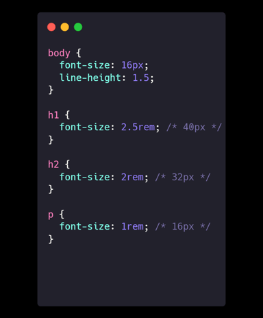
Technical Details:
Base Font Size: Start with 16px (1rem) for body text.
Responsive Scaling: Use em and rem units to ensure scalability across devices.
Heading Sizes: Establish a consistent scale for headings (e.g., H1 at 2.5rem, H2 at 2rem).
Line Height: A line height of around 1.5 times the font size improves readability.
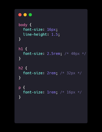
CSS Example:
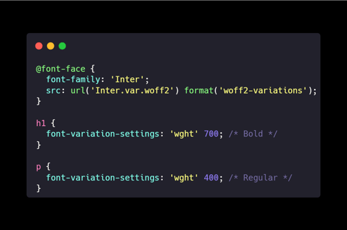
Tip: Use Variable Fonts for Flexibility
Variable fonts allow for dynamic adjustments in weight, width, and other typographic features without loading multiple font files.
CSS Example:

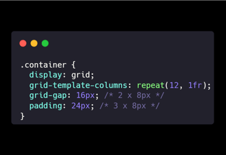
Spacing and Grids
Consistent spacing brings harmony to your design.
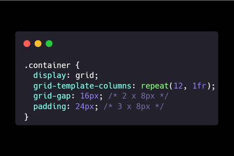
Technical Details:
8-Point Grid System: Use multiples of 8px for margins, paddings, and element sizes.
Modular Grids: A 12-column grid provides flexibility.
Alignment Tools: Utilize CSS Flexbox or Grid for precise layouts.
CSS Example:
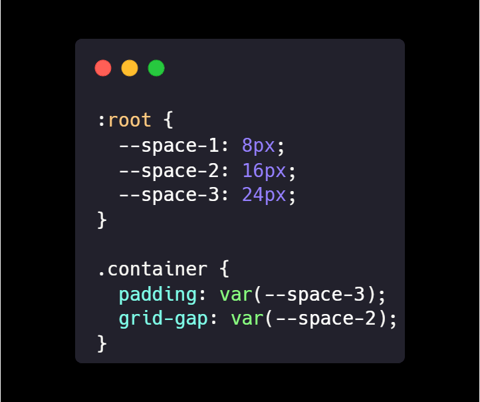
Trick: Use CSS Custom Properties for Spacing
Define spacing variables to maintain consistency and make adjustments easier.
Color Theory and Palettes
Colors can make or break your design.
Choosing a Color Scheme
Your color palette should enhance usability and reflect your brand.
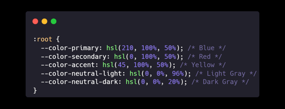
Technical Details:
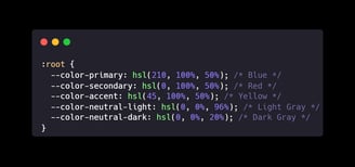
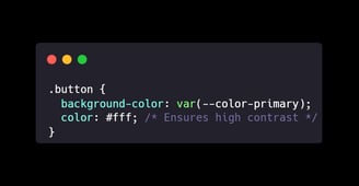
Primary Color: The main color representing your brand.
Secondary Colors: Complementary colors for accents.
Neutral Colors: Use whites, grays, and blacks for backgrounds and text.
Color Harmonies: Consider analogous, complementary, or triadic schemes.
Color Models: HSL (Hue, Saturation, Lightness) allows intuitive adjustments.
CSS Example:
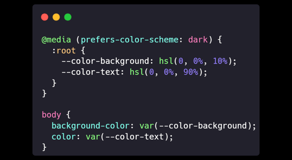
Tip: Implement Dark Mode
Supporting dark mode can enhance user experience, especially in low-light environments.
CSS Example Using Media Queries:
Color Accessibility
Ensuring your colors are accessible is a must.
Technical Details:
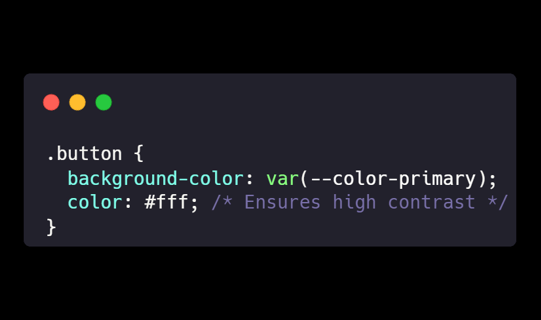
Contrast Ratios: Aim for at least 4.5:1 for normal text.
Testing Tools: Use contrast checkers like WCAG Contrast Checker.
Avoid Sole Reliance on Color: Don't use color alone to convey important information.
CSS Example:
Trick: Simulate Color Blindness
Use tools like Sim Daltonism to preview how users with color vision deficiencies perceive your design.
Buttons and Interactive Elements
Buttons are where design meets action.
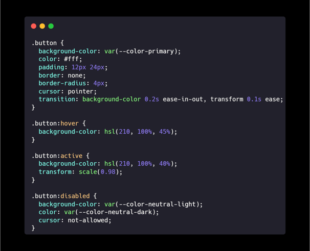
Button States
Buttons should visually communicate their state to users.
Technical Details:
Default: The standard appearance.
Hover: Slight change to indicate interactivity.
Active/Pressed: Visual feedback when clicked.
Disabled: Reduced opacity to show inaction.
Transitions: CSS transitions make state changes smooth.
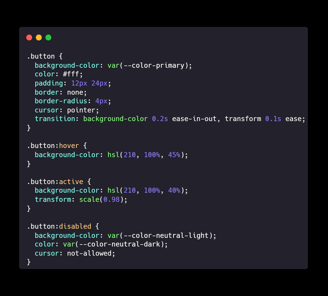
CSS Example:
Tip: Use Microinteractions
Subtle animations on buttons can enhance user engagement.
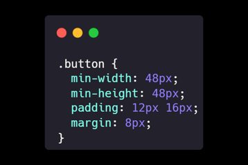
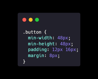
Size and Touch Targets
Especially important for mobile users.
Technical Details:
Minimum Size: Ensure buttons are at least 44px by 44px.
Padding: Use padding to increase clickable area without altering the visual size.
Spacing: Keep at least 8px between interactive elements.
CSS Example:
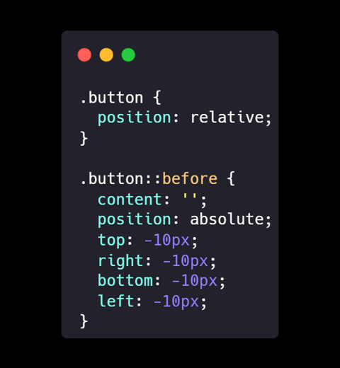
Trick: Invisible Padding for Click Areas
Use ::before pseudo-elements to increase the clickable area without affecting layout.
UI Elements and Components
Consistency here builds trust with your users.
Icons and Imagery
Icons can communicate without words.
Technical Details:
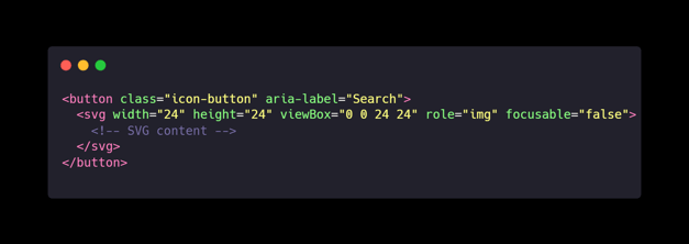
Use SVGs: They're scalable and lightweight.
Consistent Style: Stick to one icon library or style.
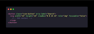
Accessibility: Provide aria-labels or titles for screen readers.
HTML Example:
Tip: Inline SVG for Better Control
Embedding SVG directly in HTML allows for CSS styling and animations.
Input Fields and Forms
Forms are where users interact most.
Technical Details:
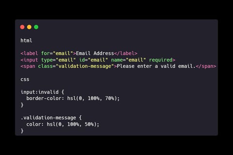
Always Use Labels: Don't rely on placeholders alone.
Real-Time Validation: Helps users correct errors immediately.
Appropriate Input Types: Use email, tel, number, etc., for better input experiences.
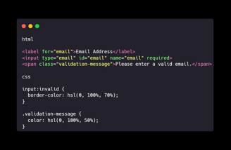
HTML and CSS Example:
Trick: Use HTML5 Validation Attributes
Attributes like required, pattern, and minlength provide built-in validation.
Layout and Navigation
A good layout guides users naturally.
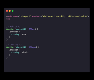
Responsive Design
Your design must work across all devices.
Technical Details:
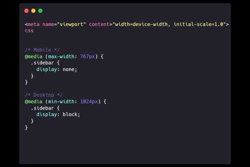
Media Queries: Adjust layouts based on screen size.
Fluid Grids: Use percentages or Flexbox for flexible layouts.
Viewport Meta Tag: Essential for proper scaling on mobile devices.
HTML and CSS Example:
Tip: Use Mobile-First Design
Start with the mobile layout and progressively enhance for larger screens.
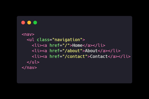
Navigation Patterns
Intuitive navigation keeps users engaged.
Technical Details:
Clear Menus: Users should know where to find what they need.
Breadcrumbs: Helpful in complex sites to show users where they are.
Consistent Placement: Keep navigation elements in expected locations.
HTML Example:
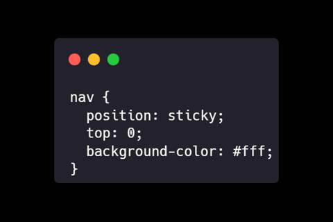
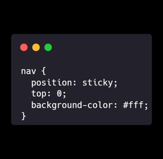
Trick: Sticky Navigation
Keep navigation visible by making it stick to the top as users scroll.
Visual Hierarchy and Content Organization
Guide your user's attention where it matters most.
Z-Pattern and F-Pattern Layouts
People read in predictable patterns.
Technical Details:
Z-Pattern: Effective for designs with minimal text.
F-Pattern: Common for text-heavy pages.
Implementation:
Place key elements along these patterns to align with natural eye movements.
Tip: Use Heatmaps for Insight
Tools like Hotjar can show you where users are focusing their attention.
Emphasis and Contrast
Make important elements stand out.
Technical Details:
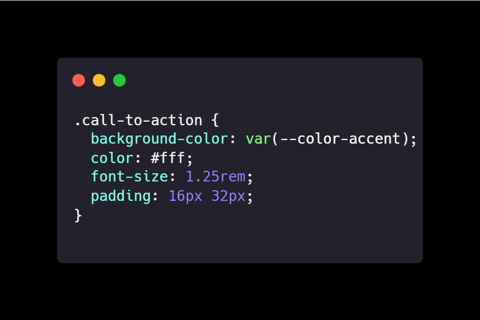
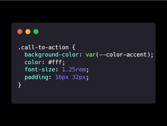
Contrast: Use contrasting colors for buttons and calls to action.
Size and Scale: Larger elements attract more attention.
Whitespace: Don't overcrowd; let your design breathe.
CSS Example:
Trick: Rule of Thirds
Divide your layout into thirds, both vertically and horizontally, and place key elements at the intersections for a balanced design.
Accessibility and Inclusivity
Design for everyone.
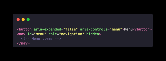
ARIA Roles and Attributes
Enhance accessibility for assistive technologies.
Technical Details:
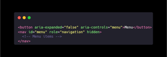
Roles: Define what an element is (e.g., role="navigation").
States and Properties: Communicate interactive states (e.g., aria-expanded).
HTML Example:
Tip: Use Semantic HTML
Using the correct HTML elements (e.g., <nav>, <main>, <footer>) improves accessibility and SEO.
Keyboard Navigation
Not everyone uses a mouse.
Technical Details:
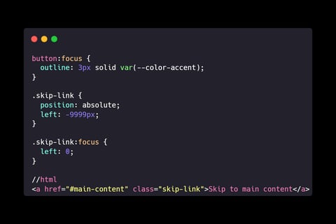
Focus States: Make sure it's clear which element is focused.
Logical Tab Order: Users should navigate in a sensible sequence.
Skip Links: Allow users to bypass repetitive content.
CSS and HTML Example:
Trick: Test with Screen Readers
Use tools like NVDA or VoiceOver to experience your site as visually impaired users would.
Performance Optimization
Speed matters.
Optimizing Images and Media
Large files slow down your site.
Technical Details:
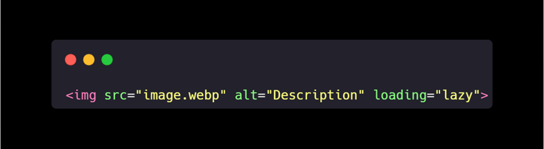
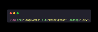
Use Modern Formats: WebP or AVIF can reduce file sizes.
Lazy Loading: Load images as they come into view.
Compression: Tools like ImageOptim can reduce sizes without quality loss.
HTML Example:
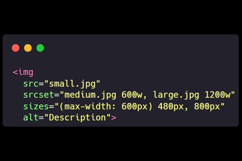
Tip: Use Responsive Images
Serve different image sizes based on the user's device.
Efficient Coding Practices
Clean code is efficient code.
Technical Details:
Minify Assets: Reduce CSS and JS file sizes.
Code Splitting: Only load what's necessary.
Caching: Leverage browser caching for static resources.
Trick: Use a Content Delivery Network (CDN)
CDNs can significantly improve load times by serving content from servers closer to the user.
Conclusion
The best applications come from a blend of solid technical skills and a keen eye for design. By paying attention to the details—sizes, colors, buttons, elements, palettes—and always keeping the big picture in mind, we can create web experiences that are not just functional but truly exceptional. Remember, the user doesn't see your code; they see and interact with your interface. Make it count.
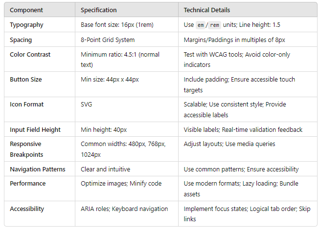
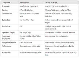
Bonus Table: UI/UX Technical Specifications